
I Screened 260 Stocks — These 10 Still Look Mispriced
The market is back near highs, but my July valuation model still found 10 stocks with attractive upside, quality scores, buy-below prices and risk-adjusted rankings.


The market is back near highs.
But that does not mean every opportunity is gone.
In fact, this is where screens become even more useful.
When markets are falling, almost everything can look cheap.
But when markets rebound, the easy discounts disappear first.
The weak businesses stop looking obvious.
The high-quality names start getting bid up again.
And the market becomes much less forgiving.
That is why July’s screen is different.
This month is not about finding the stocks that crashed the hardest.
It is about finding the companies that still look mispriced even after the rebound.
Because if a stock still screens as undervalued when sentiment has improved, that is usually worth paying attention to.
For July, I screened 260 stocks using the Dividend Talks framework.
The goal was simple:
Which stocks still deserve capital when the market is no longer handing investors easy bargains?
Not the most popular names.
Not the biggest winners.
Not the loudest AI trades.
But the businesses where the numbers still suggest the market may be too pessimistic.
Why July’s Screen Is Different
This is the part that matters.
The opportunity set has changed.
April was about broad valuation resets.
May was about the market punishing the wrong stocks.
June was about quality businesses being repriced.
July is different.
The market has already bounced.
Sentiment has improved.
And many of the obvious discounts are no longer as obvious.
So the question is no longer:
“What looks cheap after the selloff?”
The question is now:
“What still looks cheap after the rebound?”
That is a much stricter test.
And it is why this month’s spreadsheet is designed less like a simple stock screener and more like a capital allocation tool.
I do not want a list of random cheap stocks.
I want to know where the strongest balance exists between:
valuation reset
business durability
dividend support
balance sheet resilience
risk-adjusted upside
quality of earnings
margin of safety
That is the whole point of this month’s work.
What Stood Out This Month
The July screen produced a few important patterns.
1. The best opportunities are more selective now
This was not a screen where everything looked cheap.
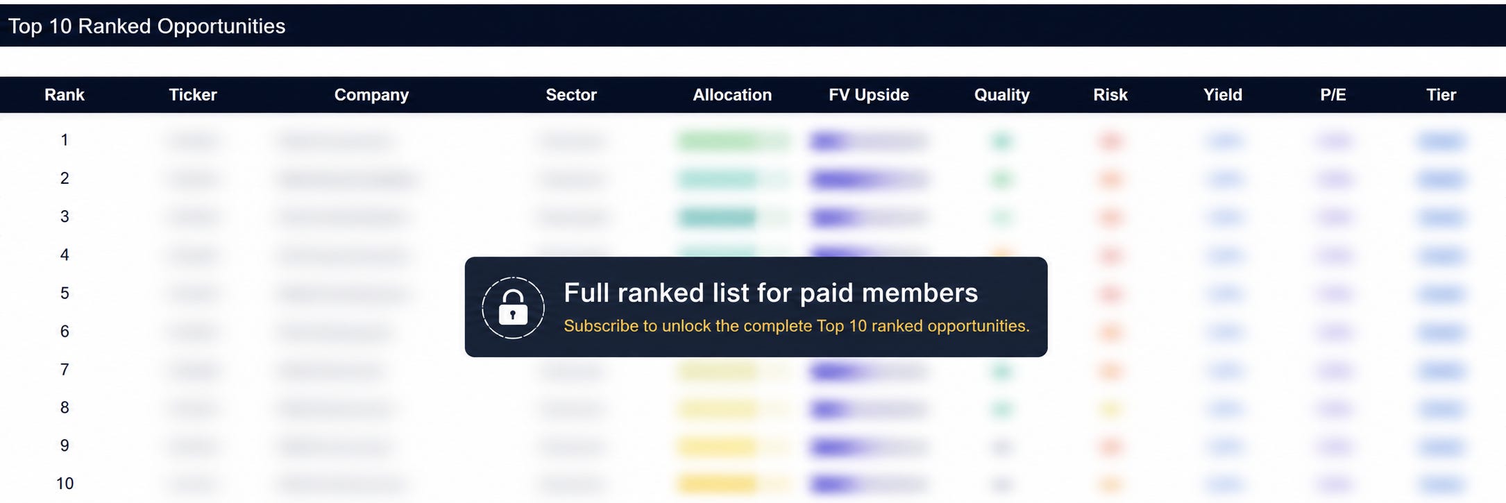
Out of 260 companies reviewed, only 15 reached the highest conviction tier.
That matters.
When too many companies rank highly, the filter probably is not strict enough.
This month, the model was selective.
The median fair value upside across the universe was around 15.9%, but the top-ranked opportunities stood out far more clearly.
That tells me the market is not broadly cheap.
But there are still pockets where the risk/reward looks very attractive.
2. Quality still matters more than pure upside
The ranking is not based on upside alone.
That is important.
If the model only ranked stocks by fair value upside, the list would simply reward the most aggressive valuation gaps.
But large upside can sometimes be a warning sign.
It may mean:
the fair value estimate is stale
the market is pricing in a real deterioration
the business has higher uncertainty
the downside case has not been fully considered
That is why the allocation score blends valuation with quality, risk and income support.
The framework weights:
40% valuation
35% quality
15% risk
10% income
This means a company with slightly lower upside can rank above a company with larger theoretical upside if the overall risk/reward is stronger.
That is how I want to think about capital allocation.
Not:
“What is the cheapest stock?”
But:
“Where is the best balance between price, quality and risk?”
3. The top-ranked names are not all from one sector
One thing I liked about this month’s output is that the opportunity set was not concentrated in just one theme.
The top 10 included:
healthcare
information technology
industrials
consumer staples
financial data / exchanges
That is a healthy sign.
It suggests the screen is not just chasing one beaten-down sector.
It is finding individual businesses where valuation has compressed faster than the underlying quality score.
Inside the top 25, industrials and information technology were especially well represented.
That is interesting because it shows the market is still offering opportunities in quality compounders, technology services, and business infrastructure names not just obvious deep-value stocks.
4. Some large upside names need extra verification
A few companies in the screen show very large upside to model fair value.
That can be attractive.
But it also needs discipline.
A big fair value gap does not automatically make a stock a buy.
It means the assumptions need to be checked carefully.
That is why the upgraded spreadsheet now includes:
data quality checks
extreme upside flags
payout ratio checks
leverage checks
dividend safety checks
bear / base / bull scenario analysis
investment committee-style research notes
This matters because a premium stock screen should not just show upside.
It should also show where the model could be wrong.
Before We Start
Most investors do not lose money because they only buy bad companies.
They lose money because they overpay for good ones.
That is why I built this valuation framework around one simple question:
What is actually worth buying now and what only looks attractive on the surface?
Paid members get the same tools I use to rank upside, size risk, compare quality and avoid value traps.
Each month, members receive:
📊 Undervalued Dividend Dashboard
A premium workbook ranking income and quality stocks by valuation, dividend safety, upside and margin of safety.
🚀 High-Upside Valuation Models
Fair value estimates, buy-below prices, scenario analysis and risk-adjusted rankings across market leaders and mispriced compounders.
🧠 Buy / Hold / Avoid Research
Clear decisions tied directly to the numbers not just market commentary.
Free readers can understand the setup.
Paid members get the rankings, the fair values, the risk flags, the buy zones and the decision-making framework.
What Paid Members Get Below
Below, paid members get access to the full July research pack, including:
the full premium spreadsheet
the Word-style research report
the complete top 10 ranked list
fair value estimates
expected upside
allocation scores
quality scores
risk scores
dividend and income scores
conviction tiers
buy-below prices
bear / base / bull scenario analysis
investment committee summary
data quality checks
research notes and watchlist framework
This is not designed to be a blind buy list.
It is designed to be a structured starting point for better capital allocation.
The goal is simple:
Screen the market.
Filter for quality.
Stress test the downside.
Rank the opportunity.
Allocate with discipline.